Your notary website isn’t just a digital business card—it’s your hardest-working employee. It operates 24/7, answers questions while you sleep, and decides whether a visitor becomes a paying client or clicks away forever.
Yet many notary websites quietly fail. They look “fine,” but they don’t convert. They get traffic, but not calls. They exist, but they don’t perform.
If you want your website to consistently turn visitors into booked appointments, you need more than a logo and a phone number. You need a conversion-focused system built on trust, clarity, and action.
Let’s break down what your notary website must have to convert visitors into clients, step by step.
Your Website’s Real Job (Hint: It’s Not Looking Pretty)
Before we talk design or features, you must understand one core truth:
Your notary website has one primary job—reduce hesitation and prompt action.
Every visitor arrives with silent questions:
- Can I trust this notary?
- Is this person legitimate and commissioned?
- Can they help me, right now?
- What do I do next?
A high-converting notary website answers these questions immediately and confidently.
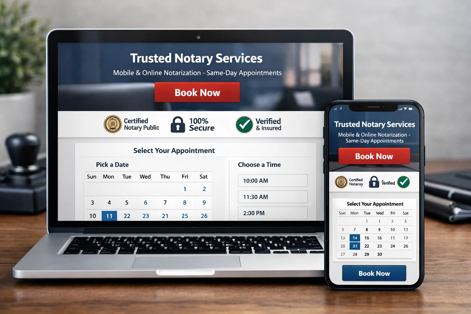
1. A Clear Value Proposition Above the Fold
The top section of your website—what visitors see without scrolling—is prime real estate. If it’s vague, confusing, or cluttered, you lose them.
Your value proposition should answer three things instantly:
- What you do
- Who you help
- How fast or convenient it is
Weak example:
“Professional Notary Services You Can Trust”
Strong example:
“Fast, Secure Mobile & Remote Online Notary Services — Same-Day Appointments Available”
This clarity matters because visitors don’t read carefully at first—they scan. A strong headline keeps them engaged and moving forward.
2. Obvious Calls to Action Everywhere
A notary website without strong calls to action is like a phone with no dial pad.
You must clearly tell visitors what to do next:
- Book an appointment
- Call or text now
- Start an online notarization
- Request a quote
And you must do it repeatedly—without being pushy.
Best practices:
- Use buttons, not just text links
- Keep CTAs action-oriented (“Book Now,” not “Submit”)
- Place CTAs above the fold, mid-page, and at the bottom
Remember, clarity converts. If visitors have to think about how to contact you, they won’t.
3. Trust Signals That Remove Fear Instantly
Notarization involves identity, legal documents, and sensitive information. Trust is not optional—it’s required.
Your notary website must visually and verbally reinforce credibility.
Essential trust signals:
- Commission details and expiration date
- State you are commissioned in
- Professional headshot (not a cropped selfie)
- Clear service descriptions
- Testimonials or reviews (even 2–3 help enormously)
Trust signals should be visible, not buried. When visitors feel safe, they move forward.
4. Mobile-First Design (Because That’s Where Clients Are)
Most notary clients find you on their phone—often in a hurry. If your website isn’t mobile-optimized, you are actively losing business.
A mobile-first notary website:
- Loads quickly
- Has readable text without zooming
- Uses large, tappable buttons
- Displays phone numbers as click-to-call
Speed and usability are conversion factors. If your site feels slow or awkward on mobile, visitors bounce instantly.
5. Clear, Simple Service Pages
Visitors should never wonder whether you offer the service they need.
Your notary website must clearly explain:
- Mobile notary services
- Remote online notarization
- Loan signings (if applicable)
- Specialized documents (estate plans, affidavits, powers of attorney)
Each service should answer:
- What it is
- Who it’s for
- When it’s available
- How to get started
Clarity reduces friction—and friction kills conversions.
6. Transparent Pricing or Expectations
Even if you can’t list exact prices, you should set expectations.
Visitors fear hidden fees and wasted time. Address that fear directly.
Examples:
- “Statutory fees apply based on state law”
- “Travel fees vary by distance”
- “Instant quotes available by request”
Transparency builds confidence and positions you as professional, not evasive.
7. Online Scheduling or Instant Contact Options
Modern clients expect convenience. If your notary website forces them to leave a message and wait, you lose momentum.
High-converting options include:
- Online booking calendars
- Text message buttons
- Contact forms with fast response promises
Even better? Combine options. Let clients choose how they want to engage.
8. SEO-Optimized Content That Attracts the Right Clients
A beautiful notary website means nothing if no one finds it.
Search engines reward clarity, structure, and relevance. Your website should naturally include phrases people actually search for—without keyword stuffing.
This means:
- Clear headings
- Descriptive page titles
- Local service language
- Helpful explanations
When done correctly, SEO brings qualified visitors—people already looking for your services.
9. Simple Navigation (Confusion Equals Abandonment)
Your navigation menu should feel obvious:
- Home
- Services
- About
- Contact / Book Now
That’s it.
Every extra option increases confusion. Every second of confusion increases abandonment.
A notary website should guide visitors like a well-marked hallway—not a maze.
10. A Human “About” Page That Builds Connection
People hire people. Your About page should reassure visitors that you’re real, experienced, and approachable.
Include:
- A professional photo
- Why you do this work
- Your experience and credentials
- Your service area
Avoid corporate jargon. Speak like a human who understands urgency and responsibility.
11. Security and Professional Hosting
If your website looks outdated or insecure, visitors subconsciously question your professionalism.
A conversion-focused notary website includes:
- SSL security (https)
- Reliable hosting
- Fast load times
- No broken links or outdated info
Your website reflects how you handle documents. Make that impression count.
12. A Strong Closing CTA That Captures Ready Clients
By the time visitors reach the bottom of your page, many are ready to act—but only if you ask them.
Your final call to action should:
- Reinforce convenience
- Reduce hesitation
- Offer a clear next step
Example:
“Ready to get your documents notarized quickly and securely? Book your appointment today.”
This is where conversions happen.
Why Most Notary Websites Still Fail
Most notary websites fail because they were built to exist, not to convert.
They lack:
- Strategy
- Clear messaging
- Trust reinforcement
- Conversion pathways
The good news? Fixing these issues doesn’t require custom coding or massive expense. It requires the right structure and purpose.
Final Call to Action
If you want a conversion-focused notary website that’s built specifically for notaries—not generic businesses—there’s a smarter path.
👉 Visit https://www.notarywebplatform.com to see how a purpose-built notary website can help you turn visitors into booked clients without technical headaches.
Your website should work as hard as you do. Make sure it’s built to convert.